
How to make a cross-browser, blurred-glass menu bar
The goal is to recreate the apple.com menubar. They do some fancy blur effects that are not supported in FireFox at the moment.
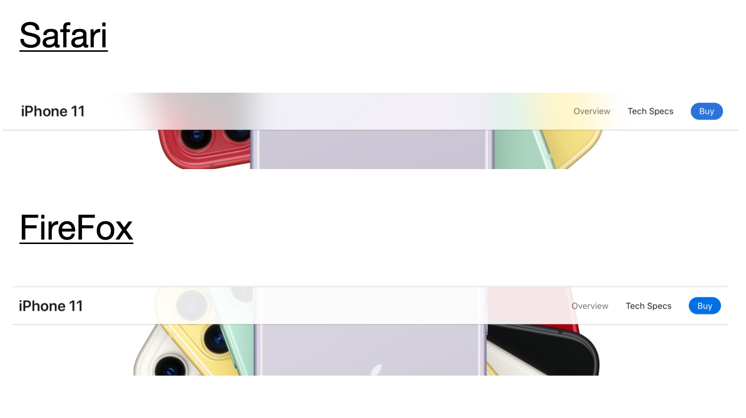
As you can see in the image above, non-WebKit browsers like Firefox don’t support the backdrop-filter CSS property as of right now. In order to achieve something like the cross-browser compatible example bellow, we therefore have to do some CSS and Js tricker.
Cross-browser compatible example
Blurred-glass menu bar in WebKit Browsers
Achieving this effect in a webkit browser is fairly simple. We just need to add a css class to the navigation bar with a backdrop-filter property:
    @supports (backdrop-filter: blur(12px)) {
        .blurred {
            backdrop-filter: saturate(180 %) blur(13px);
        }
        .nav {
            background-color: #5d5d5dc2;
        }
    }
Where it gets tricky is implementing the same effect on the menu bar in browsers without support for backdrop-filter. So to re-create the translucency, you have to get a little creative.
Blur effects in non-webkit browsers
First off, creating a blurred-glass filter in FireFox requires us to use a <svg> element trick. Essentially, a semi-transparent <svg /> with a <feGaussianBlur /> property is placed somewhere on the page.
    // svg element with blur filter applied
    <svg id="svg-image-blur">
        <filter id="blur-effect">
            <feGaussianBlur stdDeviation="10" />
        </filter>
    </svg>
Then, its id gets referenced in the CSS as a filter for the element that’s being blurred.
    /* css property referencing that element as the filter */
    .blurred-content {
        ...
        filter: url(#blur-effect);
    }
It’s quite common to see this trick in used in the wild for projects like lazy image loader libraries that blur an image while it’s loading. The effect is often achieved is often by:
- duplicating an element on-top of the original
- blurring the duplicate
- lowering the opacity of the duplicate
Generally, this approach works well for static elements whose background and / or image attributes won’t be changing anytime soon. But what about our menu bar?
Re-creating backdrop-filer effects to achieve blurring
A menu bar only blurs what’s scrolled beneath it, making it difficult to know for sure what content will end up needing the effect. What’s more, the content of the page varies unpredictably in size, color, and scale.
Web-kit browsers solved this problem by introducing the backdrop-filter CSS property. It essentially mimics the behavior outlined above, where the entire content of the DOM element’s siblings and children are duplicated and then blurred. FireFox doesn’t support backdrop-filter as of right now, and yet, it turns out the approach is very similar.
To re-create the webkit backdrop-filter filter property in FireFox, what we do is:
- duplicate the entire site’s content (excluding the menu bar of course)
- blur the container using the svg filter trick outlined above
- place it in a container element and
- put that container inside the navbar’s container.
    // select the html element we want to blur
    const blurTarget = document.querySelector('.blur-target');
    // duplicate it
    const duplicate = blurTarget.cloneNode(true);
    // place it inside a container-div
    const targetBlurred = document.createElement('div');
    // apply blurring svg effect to the container
    targetBlurred.className = 'blurred-content';
    // place duplicate inside the container
    targetBlurred.appendChild(duplicate);

    // place our blurred duplicate inside the nav bar
    const navContainer = document.querySelector('.nav-container');
    navContainer.appendChild(targetBlurred);
Finally, we set the blurred copy’s z-index bellow that of the menubar. Note that in order to avoid blurring the contents outside the menu bar, its container needs to have the overflow: hiddenproperty set.
    // navbar container element
    .nav-container {
        position: fixed;
        top: 0;
        width: 100vw;
        height: 50px;
        box-shadow:0 1px 0 rgba(0, 0, 0, .1), 0 1px 2px rgba(0, 0, 0, .1);
        z-index: 2;
        overflow: hidden;
    }
    // apply non-web-kit styling if backdrop-filter not supported
    @supports not (backdrop-filter: blur(12px)) {
        // duplicate's container
        .blurred-content {
            padding:0 1rem;
            padding-top: 20px;
            position: absolute;
            top: 0;
            left: 0;
            right: 0;
            filter: url(#blur-effect);
            opacity: 0.3;
            z-index: 3;
            height: 50px;
        }
    }
There’s a catch however. The blurred copy of the page doesn’t scroll when the page does out-of-the-box. We have to do some JavaScript trickery to get the blurred copy to scroll at the same speed and maintain the illusion of the transparency effect.
    // whenever out page content scrolls, move tbe duplicate
    const contentWrapper = document.querySelector('#content')
    window.addEventListener('scroll', function () {
        duplicate.style.marginTop = -this.scrollY + 'px';
    });
Summary
In short, it’s not pretty. In fact it can also significantly reduce the scrolling frame-rates, especially for longer and more complex pages. And, while there are some approaches out there that address this by inserting the blurred duplicate in an <iframe /> for instance, the fact is that things shouldn’t be this hard.
And if you’re thinking, “This sounds like we’ve essentially duplicated the steps outlined in the backdrop-filter specs”, you’re absolutely right. Unlike the spec, however, we can’t “Copy the Backdrop Root Image into a temporary buffer”. We don’t have access to that buffer, which is why we have to copy the actual HTML DOM elements in full, place them in a container, and then blur them all in unison by blurring the container.
Thankfully, it looks like most modern browsers are embracing the webkit backdrop-filter css property. Chrome starting supporting it since version 81 and FireFox is said to be supporting it within the next major release or two.
Updated on 2020-06-09 | 17:52