How to make your own Medium-like sharing tooltip
We’ve previously covered how to create a useSelection hook that stores the currently selected text and Styling selected text with CSS in this series. If you haven’t taken a look, I recommend you do so now as we’ll be building off of those blog posts.
For part 3 of this Browser Selection API series, we’re going to build our own Medium-like sharing tooltip. The idea is to have a simple Twitter, Email, and generic “other” sharing tooltip appear whenever text is selected on the page.
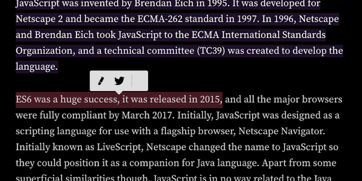
For an illustration of the finished product, go ahead and select some text in this blog-post.
Table of contents
- Creating the tool-tip
- Customizing the social-sharing behavior
- Using the Selection object to add the selected text to the url
- Showing the tooltip over the selected text
- Bonus: using the SharingApi to default to OS-default sharing panel
Creating the tool-tip
The most basic need we have to create a Medium-like sharing tooltip is well, a tooltip. This consists typically of three parts:
- A tool-tip container
- Social-sharing links
- An arrow or carrot pointing to the selected text
Let’s go step by step creating each of these.
Making a tool-tip container
The tool-tip container can just be a <div>. It should initially be hidden, since no text is selected yet, and absolutely positioned, so it can be moved around as the text selection changes. Since it’s initially hidden, it’s initial position can be anywhere, but we’ll set it to be at top: 0px; left: 0px.
<div class="tooltip-container"></div>.hidden {
display: none;
}
.tooltip-container {
position: absolute;
top: 0px;
left: 0px;
}And that’s it! Now remember that this tooltip-container doesn’t have any styling. It’s just a way for us to control the positioning of the social-sharing icons, links-container, and selected text indicator, rotated-square. The styling of our tool-tip we’ll leave until later.
Creating and styling the social-sharing links
For our purposes, we want social sharing links to Twitter 🐦, Email ✉️, and optionally a Web Share API native browser sharing mechanism 🧰. We can add this to our tool-tip container, <div class="tooltip-container"></div>, as a <div class="links-container"> with a handful of <a href> links.
<div class="links-container">
  <a
    href='https://twitter.com/intent/tweet?url=${pageUrl}&text=${description}:"${text}"&via=luqven'
  >
    <p>
      <span className="emoji" aria-label="twitter" role="img">🐦</span>
    </p>
  </a>
  ...
</div>
For out next step, we want our social-sharing links to look something like the Medium tool-tip. So we’ll give them a dark background color and box-shadow, and flex them all in a row. The position of the links is relative since it’s inside out absolutely positioned tooltip-container.
.links-container {
  position: relative;
  display: flex;
  flex-direction: row;
  justify-content: space-evenly;
  align-items: center;
  width: 120px;
  height: 35px;
  background-color: #041e42;
  box-shadow: -1px 1px 4px 1px #041e4254;
  border-radius: 4px;
  padding-left: 5px;
  padding-right: 5px;
}
Adding an indicator like an arrow or carrot
This will come down to stylistic preference for some. But, it’s a well-enough established practice that I’m recommending we go ahead and use it.
Adding this contextual-queue entails placing a rotated box bellow our links-container that acts as an arrow to the selected text. It’s absolutely positioned as well so that it can move about the page freely, alongside the links-container. We’ll control it’s top and left position using using JS as well later on.
<div class="rotated-square"></div>.rotated-square {
background: #041e42;
transform: rotate(45deg);
width: 25px;
height: 25px;
position: absolute;
}Customizing the social-sharing behavior
Typically, every social network has it’s own url-path or API for sharing content outside its network. For Twitter and Email, however, it’s quite simple.
Creating a Twitter sharing url
For twitter, all we need to do is modify a url with specific query parameters. Namely, we need the url, text, and via parameters. A query that shares a tweet linking to this site, for example, might look like this:
https://twitter.com/intent/tweet?url=https://www.luisball.com&text=Luis Ball: software engineer&via=luqven
Creating a Email sharing url
To share the selection via email it’s even easier. We just need to add a mailto link to our sharing options. Something like: mailto:name@email.com?subject=“Luis Ball”&body=“Software Engineer”%0D%0A…%0D%0A”The best of the best”, “https://www.luisball.com”
Note the
%0D%0A; these are our new paragraph URI codes. You can read more about them at the mailto URI Scheme docs.
Using the Selection object to add the selected text to the url
We want people to share the selection they’ve just made as well as the url of the page. This is where knowing how to use the Selection object come into play. In React, we can even make use of a custom useSelection() hook that does a lot of the heavy lifting for us.
Essentially, we want to end up with an object, selected = { text, selection }, where text is a string of the selected text and selection is the Selection object itself. For example:
{
"text": "where text is a string of the selected text",
"selection": {
Selection: {
anchorNode: #text ", where ",
anchorOffset: 2,
caretBidiLevel: 0,
focusNode: #text " is a string of the selected text and ",
focusOffset: 33,
isCollapsed: false,
rangeCount: 1,
type: "Range",
<prototype>: SelectionPrototype { getRangeAt: getRangeAt(), addRange: addRange(), removeRange: removeRange(), … },
text: "where text is a string of the selected text",
<prototype>: Object { … },
share-tooltip.js:26
}
}
}And using the useSelection() hook, the object should update every time the selection on the page changes. Once we have our {text, selection} object, we can use it to include the selected text string in our sharing urls.
Adding a helper function to modify url parameters
To make this simpler, we’ll use a JS helper function that formats our sharing url depending on the type of sharing, i.e. "twitter" vs "email". We’ll also give it the text that was selected and the pageUrl as arguments. Optionally, we can pass in title and description parameters as well, which for this site are generated by GraphQL queries and stored on a per-blog-post-level.
// accepts string designating link type, returns link url
export const createShareLink = (
  type,
  title = "",
  description = "",
  text,
  pageUrl
) => {
  if (!text) {
    return ""
  }

  const twitterUrl = `https://twitter.com/intent/tweet?url=${pageUrl}&text=${description}:"${text}"&via=luqven`
  const emailUrl = `mailto:name@email.com?subject=${title}&body="${text}"%0D%0A...%0D%0A${description}, ${pageUrl}`
  const shareUrl = type === "twitter" ? twitterUrl : emailUrl

  return shareUrl
}
Now, by setting the helper function as the href attribute in our link components, our sharing-url updates every time the selection changes and the component re-renders.
<a
  href={createShareLink(
    "email",
    postTitle,
    postDescription,
    selected.text,
    pageUrl
  )}
  onClick={shareLink}
>
  <p style={{ marginTop: 10, color: "white" }}>
    <span className="emoji" aria-label="email" role="img">
      ✉️
    </span>
  </p>
</a>
Showing the tooltip over the selected text
Now that we have a tooltip to show and its sharing links setup, we need to choose when and where to render it.
Conditionally rendering the tooltip
The first thing is to hide the tooltip by default, since on first render text has not been selected. We can do this the old fashioned way, by adding and removing a .hidden class conditionally that sets or removed the display: none attribute on our tooltip. But with react, its easier to simply conditionally render the tooltip altogether. We do that by determining if our selected variable, which is using the useSelected() hook to store the Selected object, is undefined or empty.
// if no current selection render nothing
if (
  !selected ||
  !selected.text ||
  !selected.text.length ||
  selected.text.length < 1
) {
  return null
}
Placing the tooltip on the right spot
Once we’ve decided to render to tooltip, we have to make sure it’s located by the selected text. To do this, we need to:
- store some information about where the selection is on the page.
- calculate new top & left offsets whenever selection changes
- store the currently selected range & its size and position relative to the viewport
- set the new location based on the position of the range
const [location, setLocation] = useState({top: '', left: ''});
...
// whenever selection changes calculate new top & left offsets
useEffect(() => {
    const position = document.documentElement.scrollTop || document.body.scrollTop;
    const body = document.querySelector('body');

    if (selected && selected.text.length) {
        // store the currently selected range
        let range = selected.selection.getRangeAt(0);
        // store the size of the range and its position relative to the viewport
        let rect = range.getBoundingClientRect();
        // there's some stylistic hard-coding bellow, it's to place the tooltip slightly off center
        setLocation({
            top: position + rect.top - TOOLTIP_HEIGHT * FACTOR,
            left: rect.left + rect.width / 2 - body.getBoundingClientRect().width / 15,
        })
    }

}, [selected])
Because this logic is all wrapped in a useEffect() hook, it will apply the changes to the tooltip on every render. And, as we’ve established, every time the selection changes our component will re-render. Making it so that our tooltip should always be correctly positioned relative to the currently selected text.
And there we have it! Now your page has a sharing tooltip that gets rendered near any selected text on your page.
Bonus: using the SharingApi to default to OS-default sharing panel
A neat little addition to our tooltip would be the browser’s native ShareApi (when supported). It’s that neat-looking drawer that pops up whenever you press the sharing icon on your phone (some desktop browsers do this too). To support this built-in sharing tooltip, allwe need to do is:
- Determine is the browser has SharingApi support
- Conditionally add an icon for the ShareApi
- Add a link to that icon that triggers the API
// store var that tells us if shareApi is supported
const [shareApi, setShareApi] = useState({supported: false, navigator: null});
...
// when we store the page url on first render, determine if shareApi is supported
useEffect(() => {
    setPageUrl(window.location.href)
    setShareApi({supported: !!navigator.share, navigator: navigator, clicked: false})
}, [])
...
<LinksContainer>
...
{shareApi.supported &&
<a href={createShareLink('email', postTitle, postDescription, selected.text, pageUrl)} onClick={(e) => shareLink(e, 'shareButton')}>
    <p style={{ marginTop: 10, color: 'white' }}>
        <span className="emoji" aria-label="share-api" role="img">🧰</span>
    </p>
</a>}
</LinksContainer>